
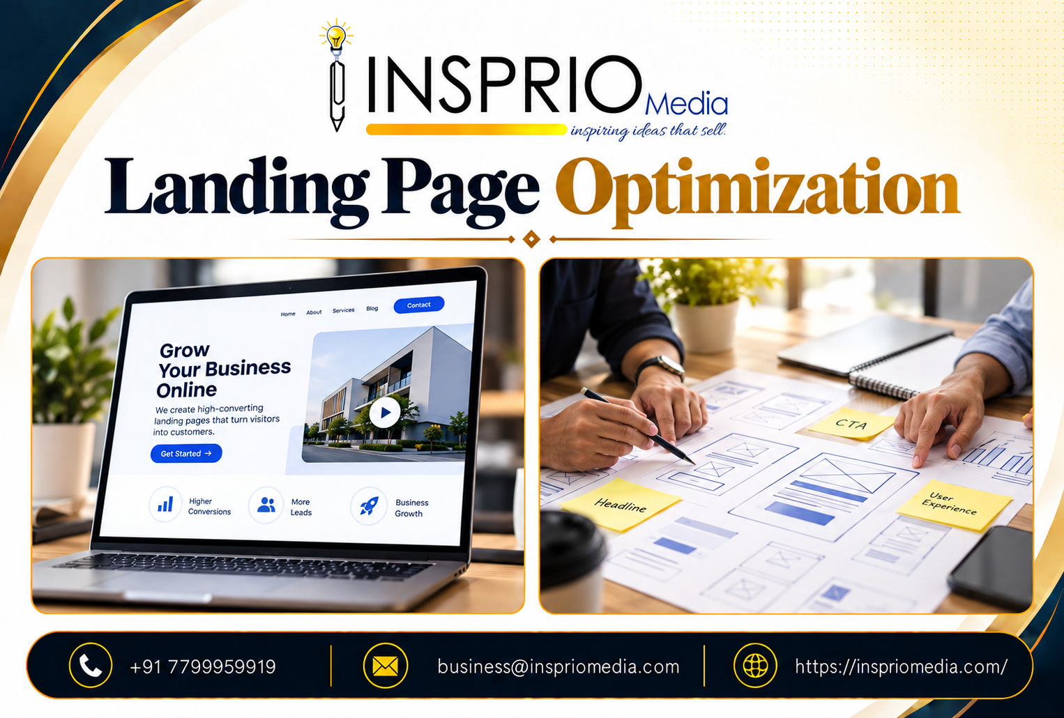
Landing page optimisation is the work of making a single page better at one job: getting the right visitor to take one specific action. The biggest gains usually come from matching the page to the visitor's intent, stating the offer clearly, adding real proof and removing anything that distracts from the next step.
It is not about changing a button from green to orange. Colour tests make good stories and rarely fix a page that has an unclear message or a weak offer.
What is a landing page, and how is it different from a website?
A landing page is a focused page built for a specific campaign or audience, usually reached from an ad, an email, a social post or a search result. A normal website page invites exploration. A landing page narrows attention to one goal, such as a quote request, a booking or a download.
That is why landing pages usually have no full navigation menu, and why sending paid traffic to a homepage is such a common waste. If you are unsure which you need, see our comparison of a landing page vs website.
Does the page match what the visitor expected?
This is the first test and the one most often failed. Visitors arrive with a specific expectation set by the ad, email or search. If the headline does not reflect that promise, they leave.
For example, a real estate developer running ads for '3 BHK apartments near Gachibowli' should land people on a page about exactly that, with relevant photos, pricing guidance and a site visit option. Sending the same click to a general company page loses most of the value of the click.
For paid traffic this link between ad and page also affects cost, because relevance influences how Google judges your ads. Our guides to Google Ads landing pages and Quality Score explain this in more detail.
What should the top of the page do?
The first screen carries most of the weight. It should contain four things:
- A headline that states the offer in the customer's own words.
- One line of support that says who it is for or what makes it different.
- A clear primary action, either a button or the form itself.
- One piece of fast proof, such as a rating, a client type you serve or a certification.
Anything beyond that competes for attention. Resist the urge to put the entire company story above the fold.
How do you build trust on a short page?
Landing pages often receive cold visitors, so trust has to be earned quickly. Use proof that is real and specific. Short customer quotes with names or business types, photographs of actual work, recognised memberships and a visible phone number all help.
If you cannot show real proof yet, say less rather than inventing it. A clear, honest page converts better than one stuffed with claims that visitors do not believe. Avoid unverifiable lines like 'best in India'.
What makes a form or call to action work?
The action is the point of the page, so it deserves care.
Keep the form proportionate
Ask for only what you need to follow up. A longer form can still make sense where lead quality matters, for example in B2B quotations, but each field should have a reason. Our article on lead generation forms explains how to decide.
Say what happens next
Tell visitors what follows after they submit: who will call, how soon, and whether there is any obligation. Uncertainty is a quiet conversion killer.
Write buttons that describe the result
'Get my free quote' beats 'Submit'. Repeat the same action further down the page for visitors who read to the end. More guidance is in our piece on call to action optimisation.
Why do mobile and speed matter so much here?
Most landing page traffic from ads and social is on phones. A page that loads slowly, shifts around as it loads, or has a form that is awkward to complete on a small screen will lose leads you have already paid to attract.
Test the page on an actual mid-range phone using mobile data. Check that the button is visible without hunting, that text is readable without zooming and that tapping the phone number starts a call.
What happens after the form is submitted?
Optimisation does not end at the click. The thank you page is a useful place to confirm the next step, share a phone number and offer a WhatsApp option. It is also where conversion tracking should fire, so your reports count real enquiries and not just page views.
Speed of response matters too. A lead that waits a day for a callback has probably spoken to someone else. Agree who owns each enquiry and how fast they will reply, and consider an automatic acknowledgement so the visitor knows it went through.
How should you test and improve over time?
Start with a clean baseline. Know your current conversion rate and how many visitors it is based on. Change one meaningful thing at a time, such as the headline, the offer or the form length, and give the test enough traffic to be meaningful. Small pages with little traffic cannot support many tests, so prioritise changes likely to matter most.
Our guide to A/B testing covers how to run tests fairly and how to avoid calling a winner too early.
Also look beyond the conversion rate. A page that produces many low quality leads is not working. Track which leads become customers, and tell your sales team to note where each lead came from.
What does a good landing page look like for different goals?
The structure changes with the goal and the cost of the decision.
- Lead generation for services: short and direct. Offer, proof, form, reassurance. A dentist or a coaching centre in Hyderabad does not need ten sections to earn a call.
- High value purchases: longer, with detail on specifications, approvals, timelines, answers to objections and several proof points. A buyer of a flat or a machine wants to feel certain.
- Events and webinars: date, speaker, what attendees will learn and a very simple registration. Urgency is natural here, because the date is real.
- Downloads and lead magnets: a clear promise about what is inside, a preview and a short form. The follow up matters more than the page.
In every case, write the page for one audience. If you serve two different groups, such as homeowners and builders, they deserve two pages.
Which common mistakes should you avoid?
- Sending several different audiences to one generic page.
- Including full site navigation that lets visitors wander off.
- Burying the benefit under long paragraphs about the company.
- Using stock photos that signal nothing about your real business.
- Offering several different actions on one page.
- Forgetting to track calls and WhatsApp taps as conversions.
- Never revisiting the page after launch.
How Insprio Media can help
We design landing pages that are built around a single offer and tied to the campaign that sends traffic to them. If you already have a page that is not performing, we can review the message, the form and the tracking and tell you what to fix first. See our landing page design service or get in touch.