
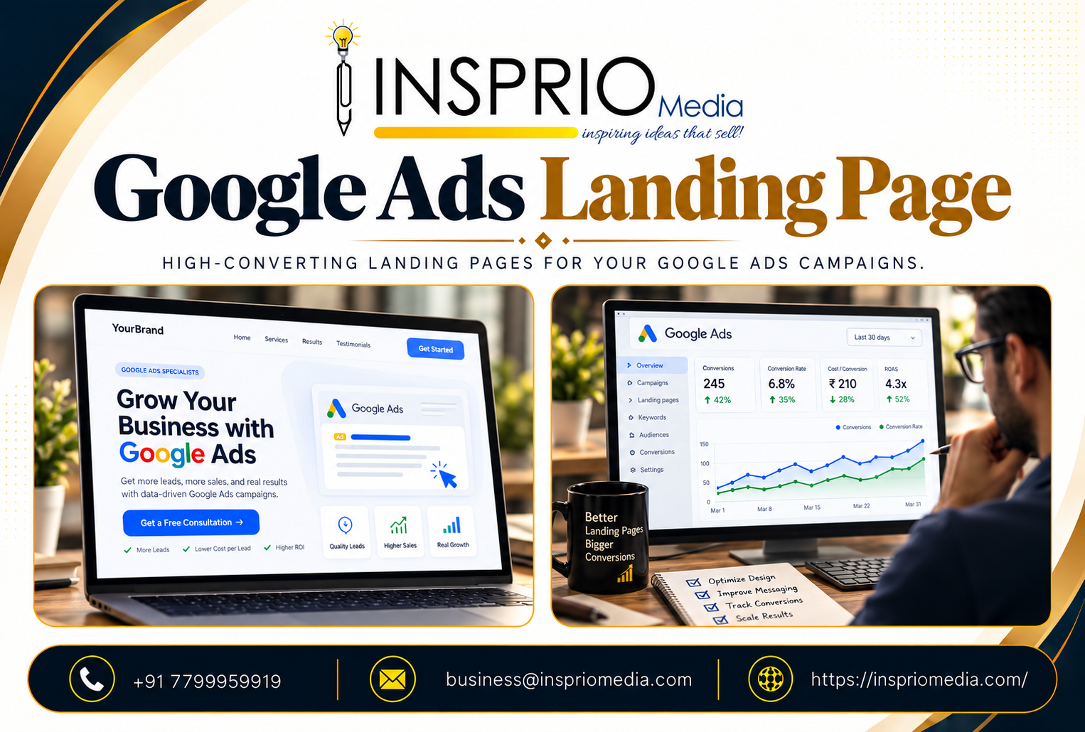
A good Google Ads landing page continues the promise of the ad, loads quickly on a phone, and makes one clear next step obvious: call, book or enquire. It is built for one audience and one offer. Sending ad traffic to a general home page is one of the most common reasons businesses pay for clicks that never become leads.
The ad earns the click. The page earns the customer. Both also influence what you pay, because Google checks landing page experience as part of ad quality.
Why the landing page matters so much
When someone clicks your ad, they have a specific question in mind. If the page answers it within a few seconds, they continue. If they must hunt for it, they leave, and you still pay for the click.
The page affects three things:
- Conversion rate. The share of visitors who take the action you want.
- Ad quality. Google considers landing page experience as part of Quality Score and the signals behind Ad Rank, which can influence your cost per click.
- Lead quality. A clear page filters out people who are not a fit, saving your team time.
Landing page or website: which should you use?
A landing page is a focused page created for one campaign or offer. A website page is part of your general site, with navigation to many topics. A focused landing page usually converts better for paid traffic because there is nothing to distract the visitor. A general page can work if it is already tightly focused on the same offer.
For a deeper comparison, see our article on landing page vs website. If you are starting from scratch, a purpose-built landing page for each service is often the most cost-effective improvement to a Google Ads account.
What a strong Google Ads landing page contains
A headline that matches the search and the ad
If the ad says 2BHK flats in Kondapur, the headline should say something very close, not Welcome to our company. This message match is the single most useful habit. It reassures the visitor that they are in the right place.
One clear primary action
Decide whether you want a call, a form or a booking, and make it the most visible element. Offering six equal choices makes the decision harder. A sticky call button on mobile suits businesses that rely on phone leads.
A short, relevant offer
Explain what the person gets and why it is worth choosing you. Use specific details: services included, areas covered, timelines, what happens next. Avoid vague lines such as quality service.
Proof that is real
Show genuine reviews, years of experience, certifications, real photos of your premises or work, and clients you have permission to name. Do not invent testimonials or numbers. Visitors and Google can both tell.
A form that fits the decision
Ask for what you need to follow up and no more. A clinic may need name, phone number and preferred time. A B2B supplier may also need company name and requirement. Each extra field lowers completion.
Answers to common doubts
Price range, timelines, location, payment options, guarantees you can actually honour. If the same questions come up on every sales call, answer them on the page.
Speed and mobile experience
Most paid search clicks in India come from phones, often on mobile data of varying quality. A page that takes too long to load will lose visitors before they read a word. Keep images compressed, avoid heavy sliders and auto-playing videos, and test on a real phone, not only a desktop browser. Buttons should be large enough to tap and text readable without zooming.
Heavy images, too many scripts and cheap hosting are the usual culprits.
Landing page mistakes that waste ad spend
- Sending all ads to the home page. The visitor has to work out where to go next.
- One page for every service. Visitors looking for hair transplants do not want to scroll past dermatology.
- Too many links and menus. Navigation to the blog, careers and about pages gives people reasons to leave.
- Slow loading or broken on mobile. This is a major cause of high bounce rates.
- Hidden contact details. If the phone number or button is hard to find, people give up.
- Forms that fail silently. Test submission regularly, and confirm that the lead reaches your inbox or CRM.
- No tracking. Without conversion tracking, you cannot tell whether the page works.
- Changing many things at once. You cannot learn what helped.
How to know if the page is working
Look at the conversion rate for the campaign, the bounce or engagement rate in analytics, and where visitors stop. Compare mobile with desktop. Listen to your sales team: if enquiries are frequent but unqualified, the page may be attracting the wrong people. If calls ask basic questions the page should have answered, add the answers.
When you have enough traffic, test one change at a time, such as the headline or the main button. Small, deliberate tests teach more than redesigning the whole page.
What to do after the form is submitted
The landing page does not end at the submit button. What the visitor sees next, and how quickly you reply, shapes whether the lead becomes a customer.
- Show a clear thank-you message that says what happens next and when. A line such as we will call you within the working day sets expectations, as long as you keep the promise.
- Offer an immediate alternative for people ready to act now, such as a call or WhatsApp button.
- Make sure the thank-you step is a distinct page or event, so your tracking records a real conversion and not a page load.
- Send the lead to a person, quickly. Many enquiries are lost simply because they sit unanswered in an inbox over a weekend.
Think of the page, the form, the confirmation and the first reply as one experience. A polished page followed by a three-day silence wastes everything above it. If follow-up is a bottleneck, simple automation can help, such as an instant acknowledgement message and a notification to the right team member.
Examples by business type
- Clinic: a page per treatment, with doctor credentials, location and map, appointment button and a plain explanation of the process.
- Real estate: a page per project, with the location, configurations, approvals you can state truthfully, site visit booking and brochure download.
- Restaurant or event venue: menu or packages, photos, capacity, booking button and WhatsApp contact.
- B2B manufacturer: a page per product group or industry, specifications, capabilities, certifications and a quotation request.
Keep the page honest and current
Offers expire, prices change and phone numbers get replaced. An outdated landing page damages trust and wastes ad spend. Review each page whenever the offer changes, and pause ads that point to anything no longer available. Also check that every claim on the page, from approvals to delivery times, is something you can stand behind. Accuracy protects both conversions and your reputation.
How Insprio Media can help
We design and build landing pages that fit each campaign, and we connect them with tracking from the start so you can see what is working. If your clicks are not turning into enquiries, our Google Ads management team can review the page and the campaign together and tell you what to change first.